High-Converting Landing Page Examples: What Actually Moves the Needle in 2026
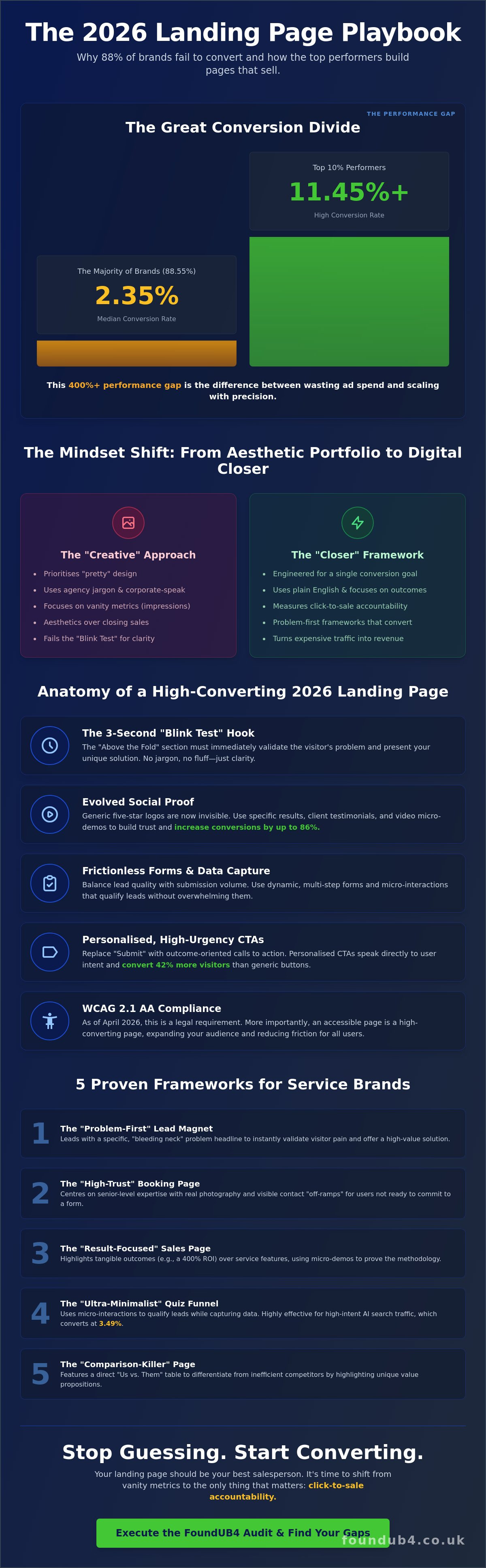
88.55% of brands are currently settling for a median conversion rate of just 2.35% whilst the top 10% of performers are hitting 11.45% or higher. It is a massive performance gap that separates those wasting budget from those scaling with clinical precision. If your Meta ads are driving traffic but your sales have plateaued, you don't need another creative refresh. You need to study high-converting landing page examples that actually move the needle in 2026. Most pages are designed by "creatives" who prioritise aesthetics over closing. I prioritise the bottom line.
You likely feel that your current cost-per-acquisition is far too high and you're tired of agency jargon that masks poor results. I agree that a landing page should be a digital salesperson, not a portfolio piece. This article promises to reveal the exact frameworks that turn expensive traffic into predictable revenue by focusing on click-to-sale accountability. We will preview the psychology of the click, the rise of AI search traffic converting at 3.49%, and the essential WCAG 2.1 AA compliance standards required as of April 2026. No fluff. Just performance.
Key Takeaways
- Stop prioritising "pretty" design and start engineering pages for a single, high-stakes conversion goal that actually closes.
- Review specific high-converting landing page examples for service brands that leverage problem-first frameworks to turn traffic into revenue.
- Master the distinction between SaaS and service-based strategies by leading with senior-level expertise rather than generic feature lists.
- Execute the FoundUB4 Audit to filter out vanity metrics and ensure your page passes the three-second "Blink Test" for clarity.
- Shift your focus from impressions to click-to-sale accountability to scale your Meta Ads without wasting budget on unoptimised funnels.
The Anatomy of a High-Converting Landing Page in 2026
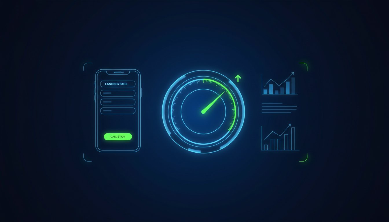
A landing page is a digital closer. It is a standalone page engineered for one high-stakes conversion goal whilst stripping away every distraction that doesn't lead to a lead or a sale. To understand The Anatomy of a High-Converting Landing Page, we must look past what "creatives" tell you. In 2026, "pretty" is the enemy of "profitable." I don't care about your brand colours or your favourite font. I care about your click-to-sale accountability. If an element doesn't justify its existence by moving the needle, it's cut. No fluff. No vanity metrics. No bloated processes.
Most agencies focus on general traffic. They want more impressions. I want more booked clients. The shift in 2026 is toward high-intent traffic validation. When you look at high-converting landing page examples from top performers, you see a 400% increase in conversion rates just from better user experience design. This isn't about looking nice; it's about reducing friction until the only logical step is to click. Every pixel must serve the bottom line. If it doesn't help you scale, it doesn't belong on the page.
The Core Components of the 2026 Framework
Your visitor decides to stay or bounce in under 3 seconds. The "Above the Fold" hook must solve their problem immediately. Don't tell them you're the "best in the industry." Tell them how you cut their waste or scale their growth. Social proof must also evolve. Generic five-star logos are white noise now. You need specific results and video micro-demos which can increase conversions by 86%. Finally, your forms must be frictionless. Balance lead quality with volume by using dynamic fields that adapt to the user. Remember, as of April 24, 2026, your page must also meet WCAG 2.1 AA standards. Accessibility isn't just a legal requirement; it's a conversion multiplier.
Why Traditional "Corporate-Speak" Kills Conversions
Stop using words like "synergy," "solutions," or "holistic." They mean nothing to a business owner with a high cost-per-acquisition. Replace these with tangible business outcomes. Use plain English. If you manage Meta Ads, say you "get more clients from Facebook." Don't say you "leverage social ecosystems for brand awareness." An authoritative, direct tone builds trust faster than any corporate brochure. It signals that you're a senior-led partner, not a junior-heavy agency. This directness is a hallmark of high-converting landing page examples that actually work. Use personalised CTAs, which convert 42% more visitors than generic ones, to speak directly to your reader's pain points.
5 High-Converting Landing Page Examples for Service Brands
Most lists of high-converting landing page examples focus on SaaS giants like Slack or HubSpot. This is a mistake for service-based businesses. You don't have the luxury of global brand recognition to carry a weak page. You need a digital closer. Small and medium-sized firms must rely on direct-response psychology rather than aesthetic polish to move the needle. Here are five frameworks that actually work for service brands in 2026.
- The "Problem-First" Lead Magnet: This B2B consultant page doesn't lead with a bio. It leads with a "bleeding neck" problem. It uses a specific headline like "Stop Wasting 30% of Your Meta Budget on Bot Traffic." It converts because it validates the visitor's pain in under three seconds.
- The "High-Trust" Booking Page: Designed for professional services, this page centres on the senior consultant. It replaces generic stock photos with real photography and screenshots. It uses "off-ramps," such as a visible phone number, for users who aren't ready to fill a form.
- The "Result-Focused" Sales Page: For coaching, this page highlights a 400% increase in ROI rather than a list of modules. It uses short, 15-second micro-demos to prove the methodology works. This approach leverages the fact that personalised CTAs convert 42% more visitors than generic ones.
- The "Ultra-Minimalist" Quiz Funnel: This uses micro-interactions to qualify leads whilst capturing data. By asking four targeted questions, it increases lead intent. High-intent AI search traffic, which converts at 3.49%, responds exceptionally well to this interactive format.
- The "Comparison-Killer" Page: This is for disruptive agencies. It features a direct "Us vs. Them" table. It highlights "No juniors" and "No bloated retainers" to distance the brand from traditional, inefficient competitors.
For more inspiration, you can study these 20 high-converting landing page examples that showcase diverse industry successes.
Analysis: Why These Examples Outperform the Competition
These pages succeed because they focus on the "Job to be Done." They don't list features; they sell outcomes. They use negative space to guide the eye toward a single, sticky CTA button. They handle the "Why should I trust you?" objection by showing social proof that tells a story of transformation. They don't just show a logo; they show a result.
Steal These Strategies for Your Own Funnel
Start with a headline that addresses a specific pain point immediately. Don't be vague. Organise your testimonials so they move from the problem to the solution. Finally, add an "Anti-Agency" section. Be transparent about what you don't do. This builds rapport faster than any corporate "about us" page. If you want to see how these frameworks apply to your business, consider a professional landing page creation service that prioritises sales over aesthetics.
SaaS vs. Service-Based Landing Pages: Why the Strategy Must Differ
Stop looking at SaaS giants for inspiration. If you're a consultant or an agency, your landing page strategy is fundamentally different. SaaS sells "Ease of Use." You sell "Depth of Expertise." Whilst a software user wants to know how fast they can set up an account, your client wants to know if you can actually solve their specific, high-stakes business problem. Most high-converting landing page examples in the SaaS world prioritise automation and self-service. For you, the goal is to humanise the digital experience. You aren't selling a login; you're selling a senior-led partnership. No fluff. Just results.
In high-performing service funnels, the "Free Trial" button is dead. It has been replaced by the "Strategy Audit" or "Growth Roadmap." This shift acknowledges that your time is the product. By offering a high-value audit rather than a generic demo, you immediately signal authority. It moves the needle by qualifying the lead before they ever pick up the phone. It turns a passive visitor into an active participant in your sales process.
The Trust Deficit in Service Marketing
The #1 fear in service-based hiring is the "Junior Staff" bait-and-switch. You sign with the senior expert but get managed by a trainee. Your landing page must kill this objection immediately. Emphasise senior-led execution. Use video to establish authority amongst a sea of faceless agencies. A 10-second micro-demo of a real client dashboard or a specific result is worth more than ten generic testimonials. Case studies that show a clear jump from a 2.86% organic conversion rate to the 3.49% AI search traffic benchmark prove you understand the 2026 landscape. Show the proof. Don't just claim it.
Psychology of the High-Ticket Conversion
High-ticket services carry high perceived risk. To convert, you must reduce the weight of a long-term retainer. Position your service as a lean, effective tool with a "No Bloat" promise. No juniors. No outsourced layers. Just direct, click-to-sale accountability. Use scarcity by mentioning your limited capacity for new clients this quarter. This isn't about looking desperate; it's about valuing your time and your results. This level of transparency is what defines the best high-converting landing page examples for growth-focused organisations. Built to convert. Built to scale. Built by experts.
The FoundUB4 Audit: Identifying Your Conversion Gaps
Most businesses waste thousands of pounds on traffic that never stands a chance of converting. They look at high-converting landing page examples and try to mimic the "look" without understanding the underlying mechanics. If your conversion rate is languishing near the 2.35% industry median whilst your competitors are hitting 11.45%, you don't need a new colour palette. You need a clinical audit of your digital assets. My audit process strips away the fluff to reveal exactly where your funnel is leaking revenue. No vanity metrics. Just hard data.
- Step 1: The Blink Test. A visitor must understand your value proposition in under 3 seconds. If they have to scroll to find out what you actually do, you've already lost them.
- Step 2: The "So What?" Filter. Audit your copy for corporate-speak. If a sentence doesn't describe a tangible business outcome, delete it. Replace "innovative solutions" with "predictable lead flow."
- Step 3: Technical Performance Check. With mobile conversion rates sitting at a low 1.82% compared to 3.14% on desktop, your load speed is likely killing your ROAS. Every second of delay erodes your bottom line.
- Step 4: The Friction Audit. Are you asking for a phone number on the first touchpoint? High-performing pages balance lead quality with volume. Don't ask for a marriage proposal on the first date.
- Step 5: The CTA Clarity Check. Your next step must be unmistakable. Use a single, high-contrast button that promises a low-risk, high-value outcome like a "Growth Audit."
Common Mistakes That Bleed Ad Spend
The ultimate conversion killer is sending Meta Ads traffic to a generic homepage. A homepage is a map with too many destinations; a landing page is a straight line to a sale. When you hide your call to action amongst "creative" design elements, you're prioritising aesthetics over profit. Furthermore, failing to match your ad creative to your landing page headline creates instant cognitive dissonance. If your ad promises a "50% reduction in CPA" but your landing page talks about "holistic marketing," the user will bounce in milliseconds. This lack of message match is why most high-converting landing page examples focus on a single, narrow promise.
Optimising for Meta Ads Specifically
In 2026, your page must be "Mobile-Native," not just "Responsive." This means using sticky CTA buttons at the bottom of the screen and larger tap targets for easy navigation. I use AI-powered heatmaps to see exactly where users drop off, allowing for data-led adjustments rather than guesswork. Don't ignore your "Thank You" page either. It is prime real estate for immediate upsells or booking a discovery call whilst the lead's intent is at its peak. If you're ready to stop the bleed, let me perform a professional growth marketing audit to find your hidden conversion gaps.
Scaling Your Growth with Click-to-Sale Accountability
A high-converting page is the foundation of any Meta Ads strategy. Without it, you are simply donating your budget to tech giants. You cannot scale a broken funnel. Whilst many high-converting landing page examples focus on the visual layer, the real performance happens beneath the surface. It is the critical difference between a "Designer" who cares about symmetry and a "Growth Strategist" who cares about your ROAS. I don't build pages to look pretty; I build them to move the needle on your predictable revenue. No fluff. No vanity metrics.
Scaling requires moving beyond superficial markers like impressions or reach. In 2026, the performance gap between the average 2.35% conversion rate and the elite 11.45% rate is wider than ever. To bridge this, you need click-to-sale accountability. This means every pound spent on Meta must be tracked directly to a booked client or a sale. My senior-led, no-nonsense approach ensures that your landing page isn't just a portfolio piece. It is a custom-built revenue engine designed to cut waste and maximise every click. We focus on high-intent traffic, particularly as AI search traffic now converts at a superior 3.49%.
No Juniors. No Bloat. Just Results.
Most agencies pass your work to a junior staff member the moment the contract is signed. I don't. You work directly with a senior consultant who has seen the inner workings of the industry for over two decades. There are no bloated retainers or outsourced layers here. My custom-built pages outperform template-driven agency work because they are built for your specific audience behaviour. Built to convert. Built to scale. Built by me. This lean execution is how you break through plateaued growth and scale your advertising efforts effectively without the typical agency overhead.
Take the Next Step Toward Predictable Growth
Stop guessing and start testing with a data-driven strategy. Your current page is likely failing to convert because it prioritises corporate-speak over solving the user's immediate, high-stakes problem. If you are tired of agency jargon and ready for real results, it is time to change your approach. Book a direct consultation to fix your funnel and transform your landing page into a digital closer that actually works. Let's stop the waste and start scaling your business with clinical precision today.
Stop Wasting Budget and Start Scaling with Precision
Settling for the industry median conversion rate of 2.35% is a choice to let your competitors win. As we have analysed through these high-converting landing page examples, the difference between a plateaued business and a scaling one is the move from aesthetic design to direct-response engineering. You don't need a bloated agency with junior staff; you need a strategy that prioritises click-to-sale accountability. Whether you are navigating the April 24, 2026 accessibility deadline or trying to capture high-intent AI search traffic, the foundation remains the same. Your page must close.
I bring over 20 years of senior-led marketing expertise to every project. My "anti-agency" philosophy means you get a master craftsman focused entirely on your bottom line. No fluff. No vanity metrics. Just a custom-built revenue engine designed to cut waste and maximise your ROAS. It's time to stop guessing and start executing with clinical precision. Scale your sales with a high-converting landing page built by a senior expert. Your future growth depends on the decisions you make today. You've got this.
Frequently Asked Questions
What is a good conversion rate for a landing page in 2026?
A top-tier conversion rate in 2026 is 11.45% or higher for the top 10% of performers. Whilst the median conversion rate across all industries sits at 2.35%, average benchmarks often reach 6.6%. Industry-specific rates vary; legal services average 7.4% whilst SaaS typically sees 3% to 5%. If your page is performing below these benchmarks, you are likely losing predictable revenue to more optimised competitors.
Why is my landing page not converting despite high traffic?
Your page is likely failing due to a mismatch between your Meta Ads creative and your headline. High traffic is a vanity metric if the user experience is poor or the message is confusing. Mobile conversion rates currently lag at 1.82% compared to 3.14% on desktop. This 42% gap suggests your mobile-native design is failing to reduce friction in the user journey. No fluff. Just a lack of alignment.
Should I use a template or a custom-built landing page?
Custom-built pages always outperform templates when you are scaling high-spend campaigns. Templates are built for the masses; they are often bloated with unnecessary code that kills your load speed. A senior-led, custom approach allows for true click-to-sale accountability. I build pages to solve specific business problems rather than fitting your brand into a pre-made grid. It is the difference between a generic tool and a revenue engine.
How many call-to-action buttons should a landing page have?
Your page must focus on one single goal but should feature multiple buttons to lead the user there. I recommend placing a CTA above the fold, one in the centre, and one at the bottom. Personalised CTAs convert 42% more visitors than generic ones. Don't confuse the reader with multiple different offers; keep the focus on one high-stakes conversion goal to move the needle.
Does page load speed really affect my conversion rate?
Page load speed is a critical factor that directly impacts your ROAS and bottom line. A well-designed user experience can increase conversion rates by up to 400%. If your page takes longer than two seconds to load, you are essentially donating your ad budget to tech giants. Speed is even more vital in 2026 since mobile accounts for over 60% of all web traffic.
What is the best way to use social proof on a landing page?
Move beyond generic logos and use specific, data-led transformation stories. Embedding short video micro-demos can increase conversions by as much as 86% according to recent 2026 benchmarks. Use authentic brand visuals rather than stock photos. Show the actual result you achieved, such as a specific jump in ROI, to build immediate authority. This is a hallmark of high-converting landing page examples that actually close sales.
Should my landing page be the same as my homepage?
Your landing page should never be your homepage. A homepage is a broad resource for exploration; a landing page is a digital closer with a single, narrow focus. High-converting landing page examples strip away navigation menus and external links to prevent distraction. Sending paid traffic to a homepage is the fastest way to bleed your marketing budget without seeing a return.
